It's time for a brief hiatus from my Snark GN and instead … a rant!
A few weeks ago I had the pleasure of talking to a young writer who showed a surprising interest and knowledge of the finer points of mechanical reproduction, cross-hatching and illustration. His questions made me realize how much of this sort of knowledge is slipping away into oblivion. In 50 years crosshatching, and draftsmanship in general, will probably be completely automated.
Crosshatching is ornamentation. It began with metalworkers and artists devising a way to utilize the printing technologies of the 15th-century and it did well for itself until the mid 20th-century. It is no longer needed for good print work, it is now a blatant affectation, a flourish, a queerly crypto-Platonic system of obsessive arpeggios and trills and runs based upon the melody of form and the counterpoint of line.
Crosshatching is not a career enhancing strategy these days. It's not sporting anymore to employ a hundred lines where one would do. An illustrator will rarely hop onto the rolodex of an art director if they insist on utilizing a historical style that carries too much cultural and technical baggage. Stick figures, flat cutouts, vector dreck and their minimal ilk are all the rage, or at least, a style of rendering which leaves everything to the imagination, including the imagination.
When I look at what most artists do to illustrate steampunk themes, for example, their work is usually amusingly anachronistic or just public domain collages. The Victorian era's visual look is a bit of a stretch for most artists now, they no longer know how to do black and white textures, much less how to illustrate by drawing alone. And this is why most art directors and illustrators can never reach further back into their historical bag of tricks than the Victorian era — they simply can't handle much more of their own backstory.
In particular, the visual style and ethos of the Baroque & the High Renaissance is now beyond many of us for two reasons:
1. It is technically arduous and requires what we used to call an "eye"
2. It requires a deep understanding of ornamentation, of the unique rhetoric of form and function combined — not separate. This also implies a genuine, visceral love of beauty, with all that implies.
The Baroque was the last period in western history when all of the arts were still of a piece with the society around them. All distancing techniques were rhetorical and fiendishly difficult to pull off without careful preparation and training. The entire process of artifice, distance, ornament and rhetoric (emotional and formal) was perfectly synthetic, on both the artist & the viewer's part.
Which is why, in addition to the many other lost causes that I have nurtured so obsessively in the dismal shambles of my professional career, the cause of the Baroque & the Renaissance is especially dear to my heart. A call to arms? Yes, a call to arms for the Neo-Baroque! A call to arms for ornament, for the acceptance that ornament and draftsmanship go hand in hand, that we owe our audience's eyes the opportunity to derive pleasure from simply looking.
Why do so many illustrators avoid skillful ornament? It is the essence of all the arts. Why are they so hesitant to betray the physical presence of the educated intellect, the synthesized rhetorical statement of hand and mind and paper? The mark of the trained hand and discerning eye is always beautiful. Hogarth's Line of Beauty is not a museum piece, it is the practical secret of classical crosshatching and contour work … it will never betray the attentive draftsman (beauty, draftsmanship … is he being serious some readers will wonder).*
We illustrators should stop pretending that financial pressures are the real issue here because our profession is mostly doomed anyway. Why not go out with a bang? Since when has illustration become a "practice" (god, what a mealy-mouthed, gutless way to describe making art)? Behaving like dentists won't impress publishers, they'll still pay us a pittance, if even that.**
Why not draw? Why not draw as if your life and soul depended on it?
Why not draw with happiness instead of making this lifeless, joyless dreck, these timid diagrams that festoon the few remaining print pages left to us? Since when has the spirit of North American illustration become such a fumbling, mawkish business of narcissism and studied vacancy?
Much of modern illustration (and comix work) is really Mannerism but what makes it depressing is that it is Mannerism which has evolved in reaction to unadulterated rubbish. This is not Mannerism building upon Raphael or Dürer, it is Mannerism building upon breakfast cereal cartoon characters and high-school yearbook doodlings.
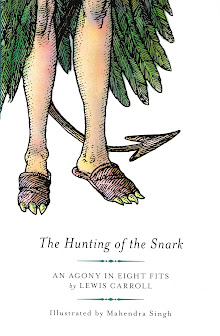
My version of Lewis Carroll's Snark was meant to expose young people to the fact that art, history, culture, philosophy, music and literature are an organic whole, a constellation of meaning which has become nearly invisible to many artists. I did this because artists who look at rubbish will always draw rubbish and I prefer to provide an alternative, no matter how flawed my work has been.
It's visual karma, really: we are what what we look at. Do what you please, but I shall be drawing in the gutter (or garret) while I look up at the stars …
… I shall walk upright, I shall strike the stars with my forehead.
__________________

Attention all shoppers! Pay no attention to the sour-pussed intellectual blather above … instead, rush over to CafePress where you can still purchase this stunning technicolored 16"x20" poster from Martin Olson's Encyclopaedia of Hell —
10% OFF ALL ORDERS OVER $40, TILL MAY 6 WITH CODE: AMAY1140
All profits from the sale of this poster will be donated to the Drinking Fund of the Distressed Artists' League.
_______________________
*As a surly aside, I insist that draftsmanship is the essence of good typography and that the latter craft should be taught to young designers from that standpoint. I also insist that typography is, and always will be, the god of design. And finally, you kids get off of my lawn or I'll call the cops. I mean it.
**I suggest that illustrators all over the world swear a secret pact, a contract sealed with human blood, Pro White and cheap whiskey, in which we swear to cunningly conceal the phrase "generation of swine" somewhere in each piece of artwork we submit to our most deserving clients.


Perhaps, as there's no Snark in sight, this is just the place for posting some words of praise, not just for this post, but for your whole explanatory enterprise.
ReplyDeleteI visit your site every time you update it, and the extent of your knowledge of all things Snark never fails to leave me ensnared, baffled, amazed, and in one word, silenced.
As for once you write something that falls into my domain of expertise (I do cross-hatching for a living) I feel I'm permitted to, at least, voice my admiration. You, Sir, are a remarkable cross-hatcher! Your example encourages cross-hatchers of the world at doing their best with producing hundreds of fine lines. And for this I shall thank you!
While I usually come here to look with bewilderment at your intriguing images of the Snark GN, it is these hiatus posts that I look forward to. This is such an excellent read. I want to applaud. I’ve posted this everywhere – Facebook, Tumblr and soon Blogger.
ReplyDeleteUnfortunately, in my world at least, illustration IS associated with breakfast cereal cartoons. A young art director looked at my illustrations and said, ‘But this is not illustration, this is fine art!’ I’ll take that as a compliment but I despair about her compartmentalization.
Yes, I’m drawing as if my soul depended on it. As an illustrator here, the only interesting work I get is what I create for myself.
Or wait, there's another option, I could join you in blowing up your drinking fund...
Thanks, Priya. It's important that we nourish the hopes of young artists and at the same time, focus them on certain hard truths.
ReplyDeleteI think we had an earlier discussion of fine vs commercial art, it's such a stupid distinction and only serves to line certain people's pockets. I've seen your lovely drawings on-line and I like the way you ignore that silly distinction. Bravo!
Drawing like our souls depend on it will not make us rich or celebrated but at least we retain our dignity and hopefully, good humour! And perhaps our children will take heed …
Keep drawing!!! My drinking fund is shrinking steadily though. Times are tough …
Thank you et merci à vous, Tororoshiru. Please forgive the delay in posting your comment, somthing is funny with my email.
ReplyDeleteDrawing hundreds, thousands, millions of lines is a funny way for us to live but it's all we know anymore.
Would it possible for you to send me a link to your work? I always enjoy looking at other's & work & French ink work can be very exciting!