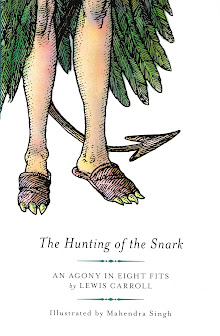
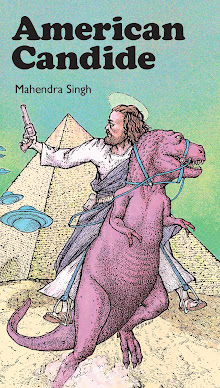
Framing devices are the very meat & drink of this illustrator's Snark, the very fritter-my-wig, as the Great One, Lewis Carroll, would have said. Careful examination of the above stanzel will reveal that the previous stanzel (72/1) is embedded within this one and that both of them are themselves the culmination of a 7-image train ride that departed an Old English Garden Party to arrive in an Old Delhi Railway Station, ca. 1876.
From whence comes this illustrator's penchant for the visual recursion of pictorial embedding? Was he lost as a child in a funhouse mirror? Was he reared by a family of Russian Matroushka dolls?
Or does he simply believe in giving his readers good value for money? So many illustrators today practice a sort of pictorial minimalism, cutting back on wasteful expenditures of either conceptual or visual complexity. Minimalism is all the rage these days with most commercial artists (understandably so when most of us are paid less than pizza delivery drivers) which means that this Snark's maximalism is the new minimalism.
The embedding of images within images and the dizzying vertigo induced by inflicting this unexpected pulling back of frames-within-frames allows the reader to rush madly ahead, like the Banker and even to be finally be lost to view if they so desire. And an unseen reader, that is the maximum desired effect of the genuine protosurrealist artist.
In short, if you can lose yourself in my Snark whilst seeking that very same Snark, my work in this Carrollian Multiverse will have been done and I can go to other worlds and places where illustrators are desperately needed to take naps on their readers' sofas, drink up all their readers' scotch, and borrow their readers' cars without permission. QED and all that, huh?
Monday, October 31, 2011
Fit 7, pg. 72/2 … on your marx, get set, snark!
Subscribe to:
Post Comments (Atom)


No comments:
Post a Comment